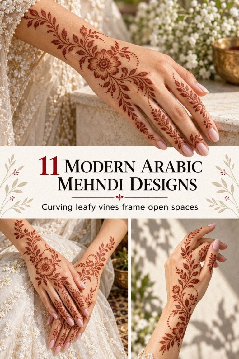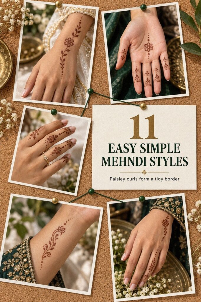
Easy simple mehndi designs can look delicate, meaningful, and memorable without covering every inch of skin. I tested mine for my cousin’s sangeet with one cone, a short drying window, and one clear rule: the pattern had to stay readable while I moved between greetings, music, and food. That constraint made every choice sharper.
I wanted reddish-brown paste, open skin, and a graceful finish that wouldn’t feel heavy. The final plan covered both hands, the wrists, and one small ankle detail, so the design felt personal without becoming overwhelming. That small rule changed everything!
Editor’s note
My editorial rule was simple: choose one focal motif, repeat its rhythm, and leave deliberate gaps. The best mehndi does not need to announce every idea at once. It can be minimal and still feel festive when the lines, placement, and stain work together.
I began with the back of the hand because it gives a floral motif enough space to look striking from a natural distance. Then I used the palms, fingers, and wrist as supporting areas rather than separate competitions. The ankle detail came later, as a symbolic extension of the hand design.
The result was not a full bridal pattern. It was an open arrangement with a few meaningful marks, reddish-brown color, and enough visible skin to keep the composition readable. If you want a similar direction, start with one motif and decide what you will leave untouched.
Before the Paste Touched My Skin
Before applying the bare hands, I had several references in mind, but I wanted my own result to feel personal rather than copied. The blank skin looked clean, and that gave me a useful starting point instead of a problem to solve.
My first sketch was crowded. I kept adding paisleys, dots, leaves, and tiny borders because I was nervous the design wouldn’t feel festive enough. Then I removed half of it and kept only the marks that supported the main floral path.
The simple very simple mehndi designs collection helped me compare open patterns with denser ones. I noticed that the negative space was doing as much work as the paste. That observation became the foundation for every later edit.
- I Chose a Minimal Floral Motif
- What Worked on My Palm?
- I Adapted the Arabesques to My Fingers
- The Centerpiece Was a Small Mandala
- I Combined Leaves and Symbolic Dots
- I Tested a Geometric Wrist Border
- Which Details Survived the Comparison?
- I Kept the Hand Composition Light
- I Edited the Overloaded Lines
- How I Let the Mehndi Dry
- How the Stain Developed
1I Chose a Minimal Floral Motif
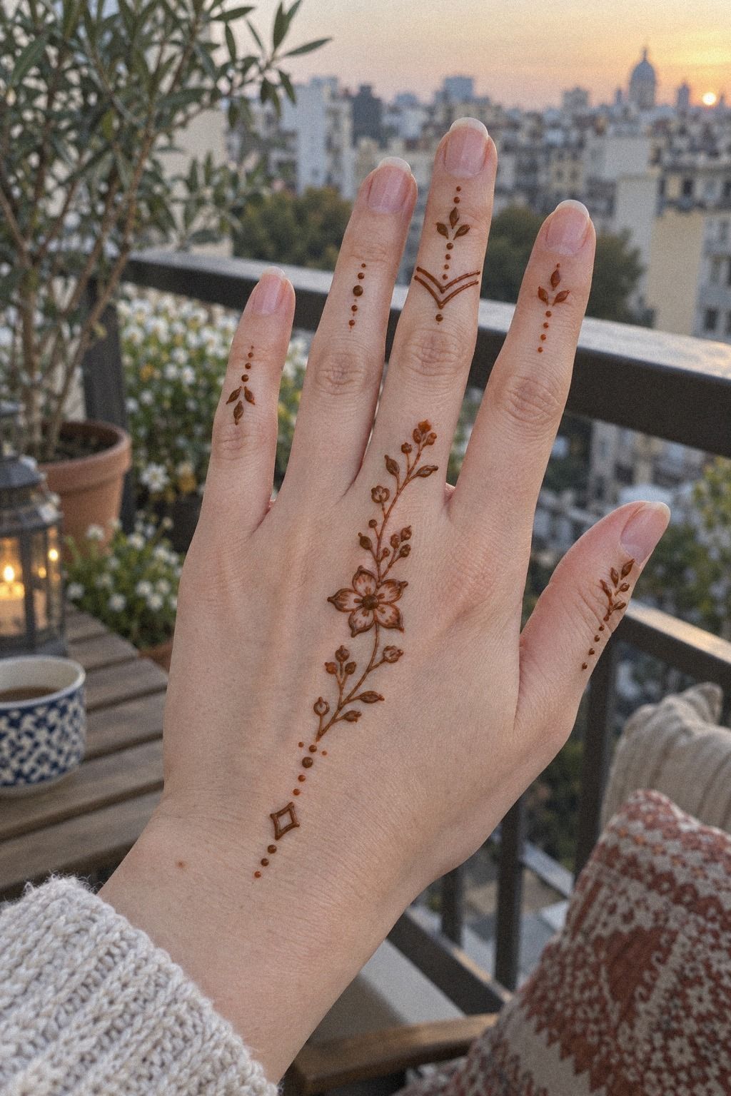
I started with a small floral stem on the back of my hand, then let two curved leaves follow the natural angle of my index finger. The flower wasn’t perfectly symmetrical, and that made it feel handmade rather than mechanical. The shape looked graceful because it followed my hand instead of forcing a rigid direction.
I used a natural henna cone with a fine opening so the reddish-brown paste could sit lightly instead of forming thick ridges. You’ll want to test the pressure on paper first. A steady line matters more than speed.
The design felt minimal but still had enough contrast for a sangeet. I placed the first flower where my hand bent least, because constant rubbing can disturb fresh paste lines.
I’d skip a large central bloom here. It can look ornate in a sketch, but it may swallow the open skin that makes a small motif elegant.
I copied the stem slowly and wiped my first attempt before the paste dried. Once the second version curved toward the finger, the pattern finally felt intentional.
The clean stem path was more striking than the size of the flower. It finally felt right!
2What Worked on My Palm?

For my palm, I wanted something open enough to move with my hand. A palm design can become dense quickly, especially when every empty patch feels like an invitation to add another dot. I kept the central area clear enough for the motif to remain readable when I curled my fingers.
I placed a compact palm circle slightly below the center instead of forcing it into the deepest crease. The position gave the shape stability and kept it from breaking visually whenever I moved. That small adjustment made the result feel understated.
I also left the upper palm nearly clear. The simple mehndi designs front hand easy references showed me how effective a quiet upper section can be. The finished hand looked polished without requiring a heavy border.
3I Adapted the Arabesques to My Fingers

The fingers needed a different scale, so I stopped treating them like miniature palms. I used short arabesques on two fingers, tiny open loops on another, and one narrow line down the middle finger. The result was flowing rather than crowded, and each finger kept its own pause.
I chose a fine-tip cone because the paste had to turn quickly without making blobs. Test the pressure before touching your skin. A heavy squeeze creates a raised line that can crack as it dries, while a light, consistent squeeze gives you a crisp edge.
I almost filled the fingertips with solid paste. The darker blocks made the rest of the design look pale, so I scraped them away and left small gaps.
That change made the pattern feel expressive. My cousin noticed the fingers first because the design moved when I waved.
The simple trendy mehndi designs examples helped me compare balanced fingers with patterns that felt too dense. Keep one finger quieter than the others. A completely filled row can look bold, but it won’t give your hand the same light movement.
4The Centerpiece Was a Small Mandala

The central mandala was the one part I expected to love, and it nearly became the mistake. I began with a small circle in the middle of my palm, then added four rounded petals and a ring of dots. The first version was too wide, so I rebuilt it smaller.
A narrow-tip cone made the petal edges easier to control. Keep the center compact, especially if your palm creases deeply. A smaller mandala stays intricate without looking busy, while a wide one can lose its shape when you close your hand.
Once the paste dried, the mandala had a timeless quality that surprised me. It felt sacred and personal, but not overly formal. I preferred that focal point to a full palm lattice because the open skin around it gave the motif space.
I stopped adding dots once the center looked balanced. Every extra mark felt tempting, yet every extra mark reduced the clarity. The strongest part was the ring of open skin around the design.
5I Combined Leaves and Symbolic Dots

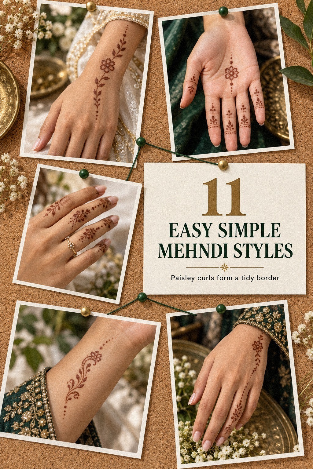
For my feet and ankles, I used leaves and dots instead of repeating the hand pattern. The ankle gave me a long vertical space, so I placed the leaves in a gentle trail that followed the natural line of the bone. This made the feet feel connected to the hands without making the whole design identical.
I used fresh henna paste sparingly around the toes because that area rubs against sandals and fabric. Leave a little space between each leaf, especially if your feet get warm while the paste dries. Close marks can merge into one dark patch before you remove the flakes.
The paisley became the emotional detail. It was small, slightly whimsical, and connected the foot design to the family celebration without copying the hands.
I’d skip a heavy ankle band. A fierce band may look impressive in a sketch, but it can feel stiff when you walk.
The simple peacock mehndi designs references gave me ideas for paisley movement. I removed the larger bird shapes and kept only one small paisley so the ankle stayed personal rather than crowded.
6I Tested a Geometric Wrist Border

The wrist needed a firmer structure than the palm, so I tested a geometric wrist border made from small diamonds and one curved line. The geometry gave the softer leaves somewhere to stop. Without that boundary, the pattern wandered down my forearm and looked unfinished.
I used smooth henna paste and kept the diamonds open instead of filling them. That choice made the result polished and crisp while preserving the warm skin between each shape. Check the spacing from several angles because tiny gaps can disappear when your wrist turns.
At first, I wanted a straight bracelet effect. A rigid line looked too formal beside the organic flowers, so I curved the lower edge slightly. The mix of structure and softness felt edgy without becoming severe.
7Which Details Survived the Comparison?
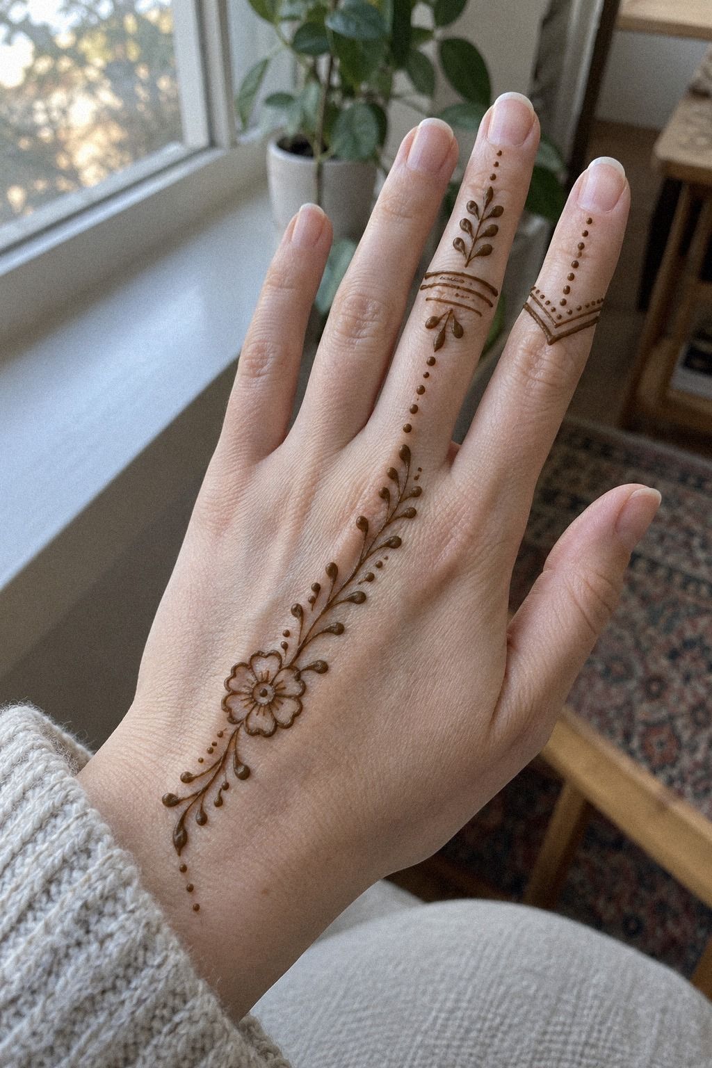
By this point, I had several options in front of me, and comparison became more useful than collecting more inspiration. The details that survived were the ones I could still recognize after I stepped back from the final arrangement. Nothing needed to be complicated to earn its place.
The floral stem stayed because it gave the hand a clear direction. The single paisley stayed because it carried family meaning without taking over the composition. Those two marks gave the design an elegant thread.
I removed three borders, two filled fingertips, and a cluster of dots near the wrist. That edit made the final result feel more polished than the busier sketches. The latest easy simple mehndi designs references reinforced the same lesson: a readable design usually has fewer competing centers.
8I Kept the Hand Composition Light
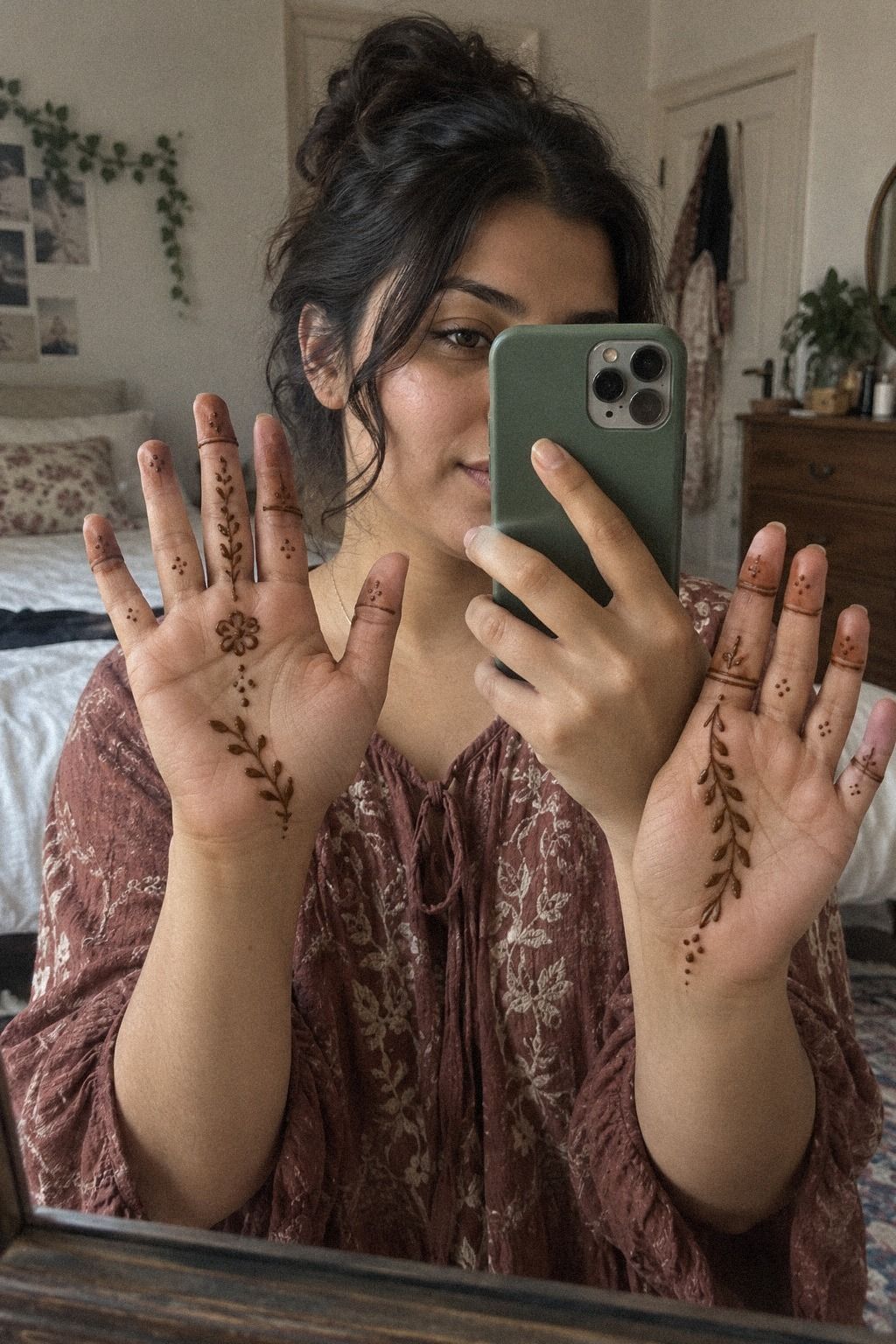
For both hands, I repeated the feeling of the motif without making mirror images. One hand carried the floral stem, while the other used a small paisley and two curved leaves. The pair looked connected, but each hand still had a distinct personality.
I worked with a small henna cone and paused after every major shape. Rotate your hand under the cone instead of forcing your wrist into an awkward angle. That adjustment kept my curves flowing and made the application feel calmer.
The open skin was the real design choice. It made the overall result feel ethereal and easy to read against my bright outfit. Exact duplication can feel classic, but it leaves no room for the natural difference between your hands.
The easy simple mehndi designs front hand easy collection helped me think about two-hand balance. I used the references for rhythm, then kept my own spacing more relaxed. The result felt more expressive because the hands were related rather than identical.
9I Edited the Overloaded Lines

The first version of my wrist had too many dots. I had added them to make the border feel finished, but they created a dark strip that competed with the floral stem. The overloaded wrist line was the clearest sign that I had confused detail with meaning.
I removed the outermost dots with a cotton bud before the paste dried completely. Then I widened the gaps between the remaining marks and softened the lower curve. That small edit made the border look lighter without changing its basic shape.
I also shortened one line that ran toward my forearm. It had no relationship to the hand motif, so it made the design feel disconnected. Once I cut it back, the wrist became a supporting detail instead of a second focal point.
That was the fix! The corrected border looked sleek, and the open space around it made the remaining marks feel intentional. The simple Pakistani mehndi designs references reminded me that one strong curve can carry more energy than a crowded collection of lines.
10How I Let the Mehndi Dry

Drying was less glamorous than drawing, but it decided whether the design stayed readable. I let the paste sit for about 1 to 2 hours, keeping my hands open and moving carefully. The raised lines felt fragile at first, so I avoided unnecessary contact.
Don’t wash the paste away immediately. Once it flaked off, the color looked orange, then deepened on the second day into a richer reddish-brown. That change was dramatic and a little magical.
I used a light lemon-sugar sealant after the paste had set, but I didn’t soak the skin. The biggest risk was rubbing the design against clothing while it was still damp. I nearly caught my palm on a sleeve, so I slowed down and kept my hands clear.
Keep your hands warm, dry, and free from swimming or heavy washing during the early color stage. The easy very simple mehndi designs collection is useful if you want a layout that won’t require frantic drying. Patience made the stain more even, and it was worth the wait!
11How the Stain Developed

The stain was light at first, then became deeper on the second day. That timing helped me judge the design fairly because the wet paste did not show the final color. The floral center looked more defined as the reddish-brown tone developed.
The palms and fingertips became darker than the outer hand, while the ankle stayed slightly lighter. That difference was expected because each area experiences different amounts of washing and friction. It also gave the design a raw, natural quality.
A few drops of eucalyptus oil were enough for my aftercare routine. I avoided soaking the hands and let the flakes come away gradually. The design remained visible for roughly one to three weeks, with faster fading on the fingers, palms, and feet.
Sangeet Night Needed a Design That Could Move
The event included music, greetings, food, and plenty of hand movement. I didn’t want to spend the evening protecting a dense pattern from every accidental touch. The design needed to remain readable while I used my hands normally.
The open floral layout worked because it stayed visible while I held a cup, waved to relatives, and rested my hands in my lap. It felt feminine without becoming overly precious. That balance made the pattern more practical than the crowded first sketch.
A design can be beautiful in a reference and still feel wrong once you start moving. Mine worked because the main marks had clear spacing and the wrist border stopped before it became restrictive. That made the whole arrangement feel playful and alive.
Less Paste, More Meaning
The strongest part of my mehndi wasn’t the largest shape. It was the small paisley near my ankle and the dots near the palm. Those details felt romantic because they belonged to the occasion rather than simply filling space.
I liked that the pattern left room for jewelry and fabric to participate. The small paisley detail gave the design a symbolic point without demanding attention from every angle. It was easy to overlook, yet it became the mark I remembered most.
If you’re choosing between two layouts, pick the one with a clearer focal point and more breathing space. It’s easier to remember, easier to apply, and easier to enjoy. The simple stylish mehndi designs for front hand references helped me see how much personality a smaller arrangement can hold.
How Much It Cost
I didn’t book a professional appointment for this sangeet mehndi. I worked on my own with a cone, sealant, cotton buds, and eucalyptus oil already in my supplies, so my extra cash cost was zero. The one-cone setup kept the process simple.
If you hire a mehndi artist, ask about the cone ingredients, design size, number of hands or feet, and event timing before you book. A clean conversation matters because an open hand motif and a bridal-style application require very different amounts of paste and time.
The more useful budget question is how much paste and time your design needs. A full bridal-style pattern takes more patience than my open floral layout. You’ll spend less when you choose a smaller motif, keep the fingers light, and avoid adding detail simply because the skin still looks empty.
The simple modern mehndi designs collection helped me compare smaller arrangements before deciding. My cash cost stayed at zero, but the real saving came from choosing a design I could apply without rushing.
Why Simple Mehndi Still Feels Personal
Simple mehndi keeps returning because it leaves room for the person wearing it. A dense design can show skill, but an open floral motif lets the skin, jewelry, movement, and clothing participate. For my cousin’s sangeet, that mattered more than filling every visible inch.
I also think smaller patterns work because they are easier to apply, photograph, and maintain during an event. The stain can fade naturally after the occasion, while the design still feels classic rather than tied to one oversized trend. That practicality never made it feel less special.
My own mistake was assuming the design needed more detail to feel meaningful. It didn’t. The ankle paisley and tiny palm dots carried more emotional weight than the borders I removed.
Those details felt empowering because they reflected my choices. They weren’t there to imitate someone else’s hands or follow every trend. They made the design feel like mine.
What I’d Repeat for Another Celebration
I’d repeat the floral stem, the open palm, and the narrow wrist border. Together, they created a stylish composition without requiring an exhausting application. The shapes were different enough to stay interesting, but related enough to feel deliberate.
I’d also keep the small ankle paisley. It was easy to overlook, yet it became the detail I remembered most clearly after the color faded. That gave the design a quiet emotional center.
I wouldn’t repeat the crowded first sketch. It took more time, looked less readable, and made me second-guess every new mark. The simpler version felt more daring because I trusted the empty skin.
The Choice I’d Make First
If I had to choose only one area, I’d begin with the back of the hand. It offers enough space for a graceful motif, stays visible during conversation, and doesn’t need dense coverage to feel festive.
A small flower with two leaves can look dainty when the lines stay fine. Add one paisley or a few dots, then stop before the design loses its focus. The back-of-hand placement gives a beginner a clear boundary.
That restraint is what made my final mehndi feel powerful. The pattern wasn’t trying to say everything at once. It had one focal point, a few supporting marks, and enough open skin to keep the design readable.
My Editorial Take: Why the Smaller Pattern Won
I started this sangeet project thinking the design needed to look impressive immediately. That instinct pushed me toward extra borders, filled fingertips, and repeated shapes. Once I removed them, I realized the more meaningful question was not how much paste I could use, but which marks deserved to remain.
The answer was a floral stem, a compact mandala, a curved wrist border, and one ankle paisley. Each element had a different job, so the four-part structure never felt repetitive. The hands carried the main story, while the ankle detail added a private note.
I also learned that simple does not mean unfinished. A minimal design still needs proportion, pressure control, drying time, and a clear stopping point. The polished result came from editing as much as applying.
The stain changed the mood, too. Wet paste looked bold and raised, while the developed color became more timeless and understated. I liked seeing the design evolve rather than expecting the first stage to reveal everything.
If I were advising someone before a sangeet, I’d suggest choosing the placement first, then the motif, then the level of detail. Don’t begin with a huge collection of references. Start with one clear design decision and let the rest support it.
My final opinion is firm: open mehndi is often more expressive than dense mehndi. It gives your hands room to move, lets meaningful details stand out, and reduces the pressure to make every line perfect. That made the result feel elegant, personal, and genuinely wearable.
A Few Things Worth Answering
How long do easy simple mehndi designs usually last?
Easy simple mehndi designs usually last one to three weeks, with faster fading on palms, fingertips, and feet. The color often deepens on the second day, then gradually softens. Keep the area dry while the paste sets, and avoid frequent soaking if you want the stain to remain crisp.
Are easy simple mehndi designs good for a first mehndi experience?
Yes, easy simple mehndi designs are an excellent first choice because open patterns are easier to apply and correct. You can test a floral stem, paisley, or small mandala without committing to a dense layout. Your first design can feel meaningful, delicate, and manageable with one henna cone.
How do I choose a mehndi artist?
Look for a mehndi artist whose portfolio shows clean paste lines, balanced spacing, and developed stain results rather than only wet photographs. Ask about the cone ingredients, drying time, and hygiene. You’ll want someone who understands your occasion and can adapt the scale to your hands or feet.
How long does mehndi paste take to dry?
Mehndi paste usually needs about 1 to 2 hours to dry before you gently remove the flakes. Keep your hands open and avoid sleeves, water, and friction. If you’re attending a sangeet, apply it early enough that you won’t need to rush the drying stage.
How dark will the mehndi become?
The stain is often orange at first, then becomes deeper on the second day as the color develops. Warmth, careful drying, and leaving the paste on long enough can support a richer result. Your palms and fingertips may look darker than areas that rub against clothing.
What is the best placement for easy simple mehndi designs?
The back of the hand, fingers, wrist, and ankle are strong choices because simple motifs stay visible without needing dense coverage. Palms can look haunting in their depth of color, but they experience more washing and friction. If you want a clear starting point, choose an open back-of-hand floral pattern.
Where I’d Start First
If I had to pick one, I’d start with the small floral back-of-hand motif. It uses less paste, dries without a bulky crust, and stays readable as the color deepens. The small floral motif also gives you an easy place to practice pressure.
Save it for your sangeet, then let the reddish-brown stain carry the memory for a few weeks. That’s the part I’d keep: a vintage feeling, a personal symbol, and enough open skin for the design to breathe.