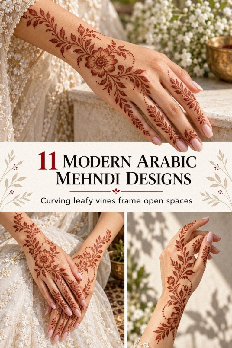
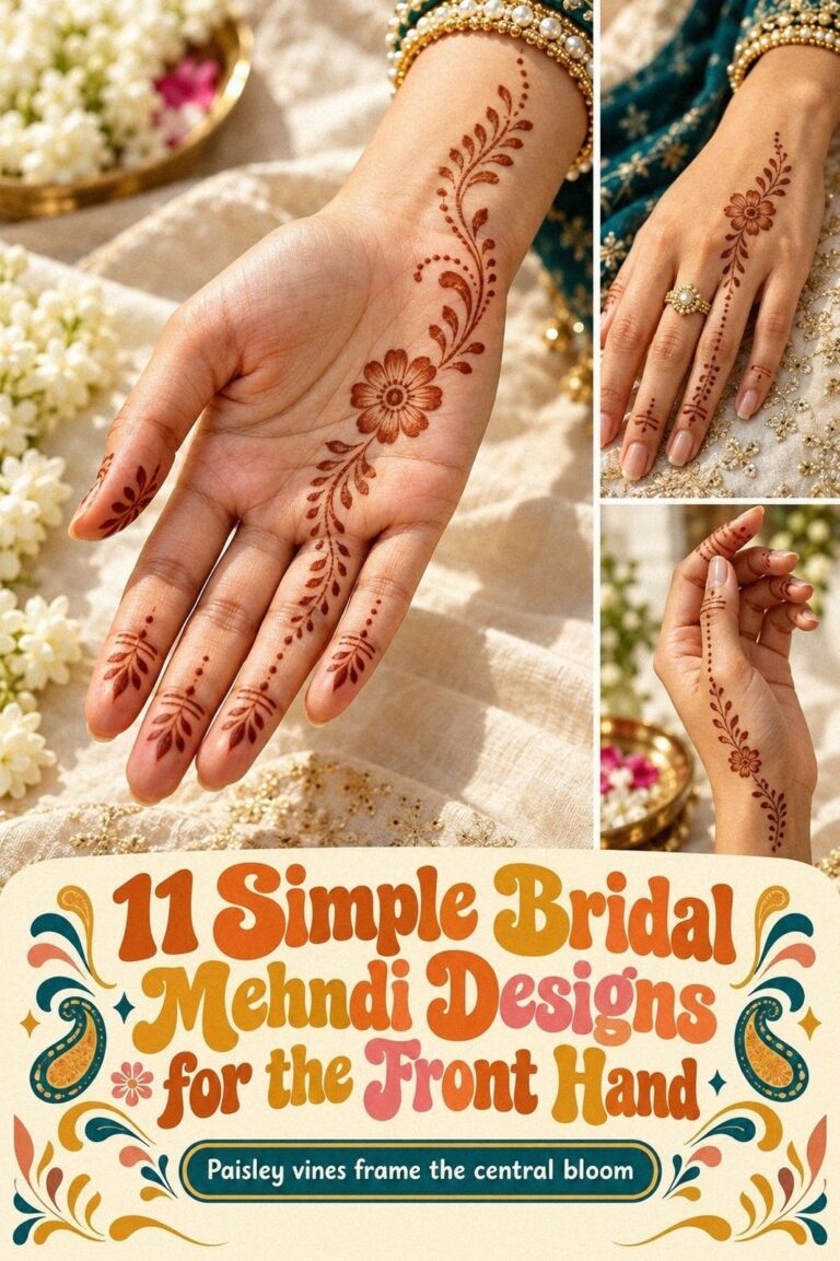
Bridal fancy mehndi designs can look intricate without feeling heavy, especially when the fingertips carry the detail. I almost chose a crowded full-hand pattern, but a simple paisley rhythm made the whole design feel more personal. The henna paste dried for 1 to 2 hours, and the color deepened on the second day. That changed everything!
Here’s what it looked like before:
Before the application, my bare hands had no saved motif and no clear decision about coverage. I had skin waiting for something meaningful, but I didn’t want a random pattern that would feel disconnected from the wedding details.
The blank fingertips made every choice look bigger than it was. I kept comparing simple new bridal mehndi designs with fuller examples, and I noticed that the most polished options gave the eye somewhere to rest around the open skin.
I wanted the bare fingertips to remain visible, with a few purposeful marks leading toward the wrist. That restraint felt personal, feminine, and practical. You can see the starting point clearly, without treating the bare skin as a problem that needs fixing.
- Choosing Simple Bridal Fancy Mehndi Designs
- Which Latest Bridal Fancy Mehndi Design Actually Worked?
- Meera’s Jewelry Match: Motifs With Meaning
- Test Fine Strokes Before You Commit
- Full Hand or Open Palm?
- Let Bold Panels Meet Delicate Details
- Add One Personal Symbol
- The Wrist Transition Changed Everything
- Can Both Bridal Hands Match Without Mirroring?
- Protecting Fresh Mehndi Before the Ceremony
- Care for a Darker Bridal Stain
1Choosing Simple Bridal Fancy Mehndi Designs

I started with a fine-tip cone and one central idea: a paisley, a flower, and a trail of dots toward each fingertip. I wanted the pattern to feel delicate but still striking from several feet away. You don’t need every inch covered for the design to read as bridal.
The first choice was the hardest. I looked at simple fancy mehndi designs and rejected the most crowded examples because their tiny details competed with one another. My preference was a crisp center with open skin around it, which made the reddish-brown paste look graphic and understated.
I asked for a classic paisley rather than a highly modern symbol. It gave the pattern a graceful curve without making the hand look busy. You can swap the paisley for a small floral loop if your jewelry already has strong teardrop shapes.
And I kept the fingertips slightly lighter. Fresh paste. No rush!
That small decision made the final pattern feel understated instead of overly ornate.
For your own booking, save two or three references and circle the exact part you like. You won’t need to copy a full design. A single curve, border, or dot arrangement can become your personal starting point, and that focused choice is usually worth it.
2Which Latest Bridal Fancy Mehndi Design Actually Worked?

The latest bridal fancy mehndi designs I compared had one detail in common: the artist left breathing room around the main motif. Some used ornate palm panels, while others kept the center minimal and placed the drama along the fingers. I preferred the powerful contrast.
I chose the open-palm layout because it made my hands feel longer when I lifted them. The deep red-brown paste stood out against my skin, and the flowing trails looked elegant beside a slim bracelet. You can explore latest new bridal mehndi designs before deciding which direction offers the best value for your ceremony.
My second comparison was between a mandala center and a floral center. The mandala looked powerful and symmetrical, but the flower felt more romantic and personal for my ceremony. I didn’t want the design to resemble a formal grid when I moved my hands.
But I didn’t dismiss bold patterns completely. A small solid panel near the wrist gave the lighter details enough contrast, and that contrast made the delicate dots easier to notice.
If you’re comparing references, place the side-by-side references together and study which designs repeat the same shape too often. You’ll notice which ones have a more expressive rhythm and which ones feel stiff when your fingers move.
3Meera’s Jewelry Match: Motifs With Meaning

My jewelry had rounded stones and a narrow chain, so I matched it with small floral motifs instead of sharp geometric blocks. The connection was subtle, but you could see it whenever I lifted my hand. I wanted the mehndi to support the jewelry, not compete with it.
I tested a symbolic peacock shape near the wrist because peacock details can feel sacred and celebratory. The first version was too large, so I asked for a smaller head and a longer curved tail. That adjustment made the motif look sleek and graceful beside the bracelet.
The artist used red-brown henna paste in a steady, even flow. I liked that it wasn’t flat or overly dark while wet. You can study simple bridal mehndi designs to compare how jewelry-friendly patterns leave space around rings.
I also kept the finger details symmetrical enough to look polished, but not so identical that they felt printed. One finger received a tiny flower, another a row of dots, and the middle finger carried the strongest curve.
I included a peacock motif because it felt expressive without becoming edgy. If your necklace is ornate, you might prefer understated palm detail. If your jewelry is minimal, a stronger wrist motif can give your hands an iconic focal point.
Why force your jewelry and mehndi into separate styles? I wanted one meaningful connection between them, not an exact match. That balance made the result feel timeless.
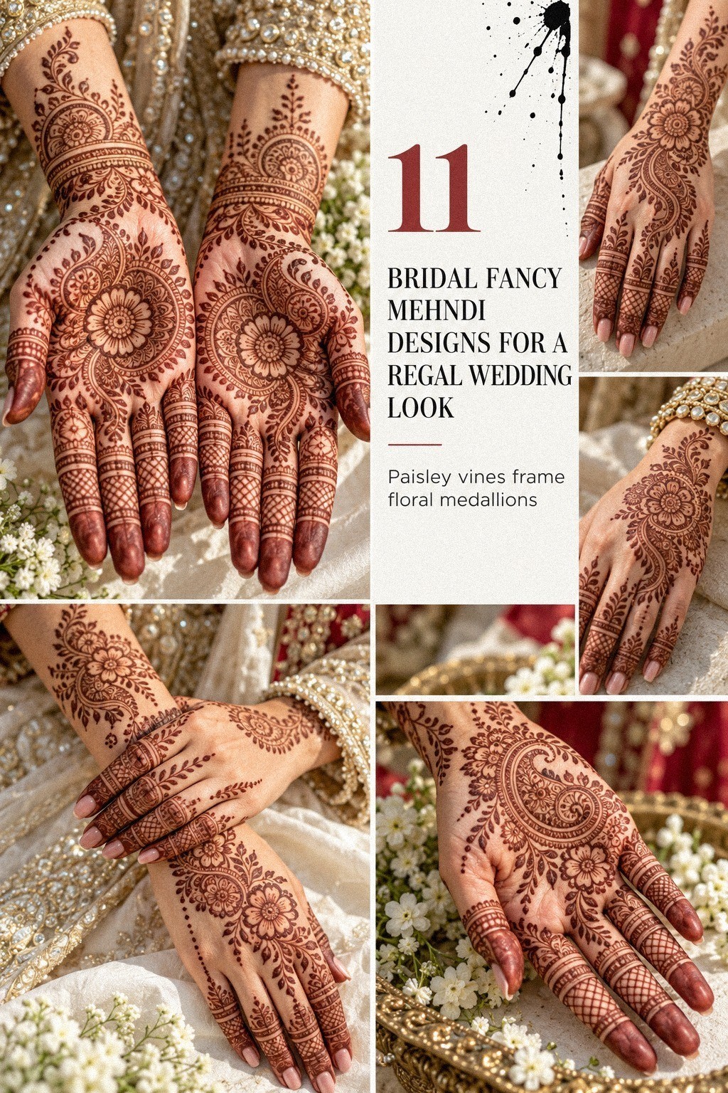
4Test Fine Strokes Before You Commit

For this part, I tested fine hand-drawn strokes on the side of my palm before committing to the full design. The test helped me judge whether the delicate lines would stay crisp after the paste dried.
5Full Hand or Open Palm?
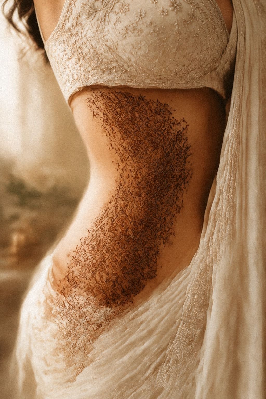
The hands in my reference had full coverage, bold bands, and repeating flowers. I loved the fierce effect, but I knew I wanted that level of detail only for a special area, not across every visible part of my hands.
I chose full palm coverage only through a central panel, leaving the outer palm and some finger space clear. That gave me the bold bridal feeling without making the whole design look solid. You can compare the balance with latest fancy mehndi designs before choosing the coverage level that fits your budget.
The wrist received a wider wrist border, while the fingers carried smaller marks. This created a flowing path from the palm to the bracelet. I liked the way the pattern moved instead of stopping abruptly at the edge of my hand.
My first instinct was to fill the open spaces with extra jaal. I changed my mind because the lighter layout looked more elegant in motion. You might prefer dense coverage for a ceremony, but dense does not automatically mean more meaningful.
The dried paste needed time to set without smudging. I kept my hands still, accepted the awkwardness, and let the artist finish one side before beginning the other. That patience kept the edges crisp and prevented the bold panel from spreading into the open skin.
6Let Bold Panels Meet Delicate Details
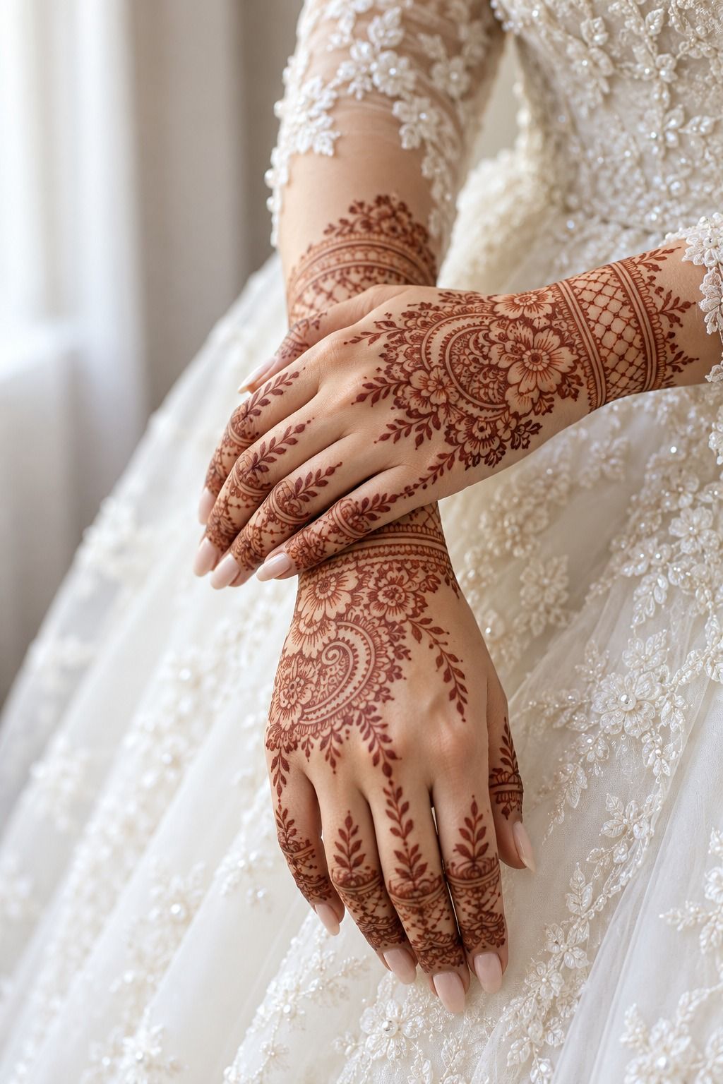
The strongest contrast came from pairing a bold forearm panel with dainty details around the hand. That balance kept the pattern fierce in one area and delicate in another.
7Add One Personal Symbol
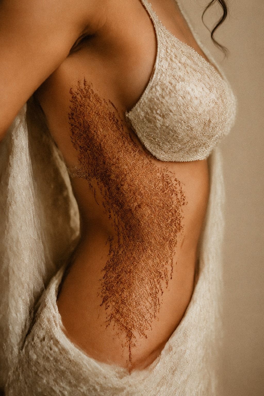
I wanted one symbol that belonged to me, not just to the reference. I chose a tiny sun motif near the base of my thumb because it reminded me of early morning ceremonies and the light in my grandmother’s courtyard.
The artist drew it with a clean center and short rays, then connected it to a curved vine. The symbol looked expressive without announcing itself. You might choose initials, a flower from your bouquet, or a small paisley tied to your family tradition.
I looked through easy new bridal mehndi designs for small motifs that could be adapted without crowding the palm. The best references were simple enough to redraw but distinctive enough to feel iconic.
My first idea was a name hidden inside the pattern. I rejected it because the hidden initials would have made the design feel less timeless. A symbol gave me more room for interpretation, and it looked cleaner once the paste was removed.
And the personal mark didn’t need to be large. It only needed to be placed where I would notice it. You can keep your meaningful detail near the thumb, wrist, or finger instead of placing it at the center of the design.
That meaningful detail became my favorite part. It was quiet, personal, and impossible to mistake for a random decoration. Yes, absolutely, that small detail was worth it!
8The Wrist Transition Changed Everything

The wrist transition was where the design could have gone wrong. A narrow vine gave the fingers somewhere to lead, while a wider border kept the pattern connected to the palm.
9Can Both Bridal Hands Match Without Mirroring?

My two hands didn’t need to be identical. They needed to feel related. I kept the same central paisley and similar wrist rhythm, then allowed the smaller finger details to vary slightly.
The artist placed a matching mandala accent on one palm and a floral accent on the other. The difference gave the pair a playful quality, while the shared borders kept everything connected. You can find more ideas through easy bridal mehndi designs if you want coordinated but non-identical palms.
I checked the hands with palms open, fingers together, and wrists relaxed beside each other. From each position, the balance looked strong. One wrist needed a slightly longer vine so the visual weight matched.
This was where I stopped trusting a flat reference. You should check how your designs behave when your fingers bend, because a neat arrangement can look uneven during real movement.
The artist adjusted one curved border by a few millimeters. That small change made the pair feel more harmonious without making them mechanical.
Would I choose exact symmetry next time? No.
A little variation made the design feel handmade, meaningful, and alive. Your hands can match in spirit without mirroring every dot.
10Protecting Fresh Mehndi Before the Ceremony

Fresh mehndi needs a little protection while it sets. I kept the fresh paste dry, avoided unnecessary hand movement, and planned the application early enough that I wouldn’t need to hurry afterward.
I also kept my supported hands away from rough contact while the paste dried. That made it easier to preserve the fine details and let the stain develop without accidental smearing.
11Care for a Darker Bridal Stain
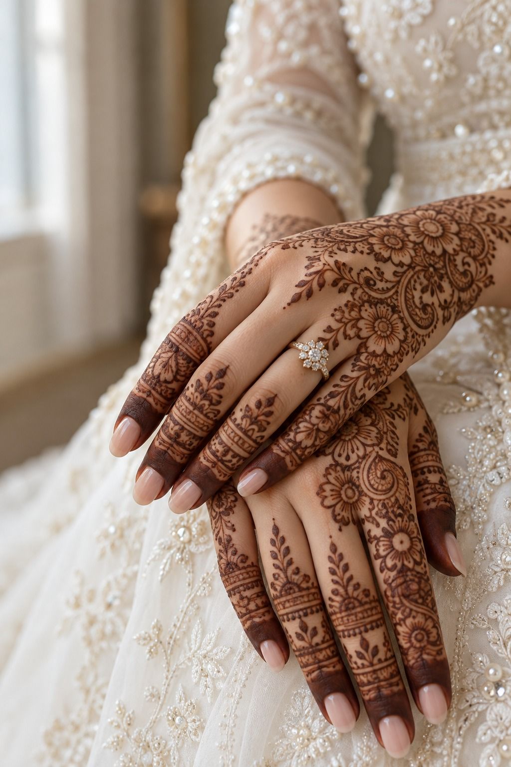
After the paste dried, I let it remain in place for about 1 to 2 hours before gently removing it. I didn’t scrub the skin or rush the process. The color was lighter at first, then it grew darker by the second day.
The dried paste stayed attached with help from a lemon-sugar seal while I waited. I used only a light layer because too much moisture can make the surface sticky and difficult to manage. Your artist may suggest a different approach based on the paste and your skin.
I also kept water away during the first part of the stain process. Once the dried paste was removed, I used a small amount of eucalyptus oil and avoided harsh washing. The color developed gradually, so I didn’t judge the final result too early.
The stain lasted roughly one to three weeks, depending on placement, washing, and daily activity. You can protect the darker color by limiting strong sunlight and skipping rough scrubbing while the design is fresh.
But fading isn’t a failure. It is part of what makes temporary mehndi meaningful and suited to weddings, Eid, Diwali, sangeet celebrations, and other special occasions. I liked knowing the pattern would soften instead of staying fixed forever.
The darker second-day stain looked richer than I expected. It was vibrant, personal, and still recognizably mine after the darkest day had passed.
How Much Did My Bridal Mehndi Cost?
I won’t pretend there is one universal price for bridal mehndi. The total changes with coverage, detail, location, occasion, travel, and the artist’s booking structure. A small hand motif and full bridal palms aren’t comparable services, so ask for a written quote before you confirm.
For planning, I used the following illustrative US cost ranges. They aren’t guaranteed prices, but they gave me a useful starting point before discussing the actual design.
I asked whether the quoted design included both hands, fingertip detail, wrist coverage, and the finishing seal. You should ask the same questions because a simple phrase like “bridal hands” can mean very different amounts of work.
My useful budget plan was to separate coverage, travel, and add-ons. That made the conversation clearer and helped me decide whether the wrist extension was worth keeping.
For comparison, latest fancy mehndi designs helped me decide which details mattered most. I kept the symbolic wrist vine and removed one extra border. That choice made the design feel more polished and kept the scope honest.
The right budget isn’t the one that buys the most paste. It’s the one that protects the detail you care about, gives the artist enough time, and matches the occasion without forcing a crowded design.
What Should the Quote Include?
Before confirming, I asked for the written mehndi quote to list both hands, fingertip coverage, palm coverage, wrist extensions, travel, and any finishing seal. That made the final cost easier to understand.
A quote should also explain whether the artist is charging by time, by hand, by coverage, or by the complete bridal package. These time-based pricing models can produce very different prices for similar-looking references.
I compared simple new bridal mehndi designs with fuller examples and marked the details I actually wanted. That helped me avoid paying for elements I would barely notice once the design was on my hands.
Ask how long the application may take, how long the paste should remain, and whether travel changes the price. You’ll have a much better sense of value when the quote matches the real scope.
Why the Stain-First Bridal Rule Matters
The part I kept returning to was the difference between choosing a picture and choosing a feeling. A reference can be ornate, dramatic, and perfectly arranged, but your hands still have to carry it through real moments.
You’ll lift a glass, adjust your veil, greet relatives, and hold someone’s hand. The design has to move with you.
My personal rhythm rule is simple: choose the pattern’s movement before the decoration. I decided where the palm would feel bold, where the skin would stay open, and how the wrist would guide the eye. Only after that did I add the sun, paisleys, flowers, and fingertip dots.
I made one mistake during the planning stage. I collected too many references and started combining every favorite detail into one crowded sketch.
It looked impressive for about ten minutes. Then I noticed there was nowhere for the eye to rest.
I went back to the cleanest layout, and the design immediately felt more elegant.
You don’t need a completely new motif to make bridal mehndi feel meaningful. You need one decision that belongs to you. Mine was the tiny sun.
Someone else might choose a peacock, a family flower, or a flowing jaal that echoes the embroidery on a wedding outfit.
And I wouldn’t measure success by how dark the stain looks in the first hour. The paste is only the beginning. The color changes, the details soften, and the memory of the application becomes part of the piece.
That is why I prefer a bold center with delicate edges. It feels expressive in person, and it leaves room for your hands to remain visible.
The design doesn’t have to compete with your jewelry or your ceremony. It only needs to make you recognize yourself.
What I Would Change Next Time
If I repeated the process, I would bring fewer references and make the fingertip rhythm my first decision. Too many saved examples made me second-guess details that had looked right from the beginning.
I would also confirm the quote earlier. Knowing the budget for wrist extensions and extra borders made it easier to protect the motifs that mattered most.
The one thing I wouldn’t change is the open palm. That space made the intricate marks feel more striking, and it gave the final stain a graceful balance.
Before You Book Your Mehndi Artist
Before booking, decide whether you want a minimal central motif, fuller palms, bold fingertips, or a flowing wrist connection. You don’t need every answer, but you should know which feature carries the emotional weight.
Bring two or three references and explain what you like in each. You can use latest new bridal mehndi designs for coverage ideas and easy new bridal mehndi designs for smaller personal symbols.
Ask how the paste is made, how long it should dry, and what paste aftercare the artist recommends. A careful conversation protects the final color and helps you understand whether the service is worth the price.
I also asked whether the artist had experience with bridal timing, fingertip detail, and uneven hand movement. Those details matter because a design can be beautiful in a reference and still need thoughtful adjustment on real hands.
My Day-Two Color Check
The color changed more than I expected after the darker second-day stain appeared. The first evening looked soft and orange-brown, but the next day brought out the richer red-brown tone I had hoped for. The second day delivered the color I wanted!
I waited before judging the result. That patience mattered because color development happens gradually and can vary across fingertips, palms, and wrists.
The final tone made the dainty details easier to see without turning the design heavy. I understood then why the drying time, gentle removal, and careful aftercare were part of the design value, not minor extras.
The Questions I Get Asked Most
How long does bridal fancy mehndi usually last?
Bridal mehndi usually lasts about one to three weeks, depending on washing, sunlight, placement, and daily activity. The color often deepens on the second day, then gradually softens. Your palms and fingertips may fade at a different pace than your wrists.
How long should the paste stay on?
Let the paste dry for about 1 to 2 hours, unless your mehndi artist gives different instructions. Keep your hands still while it sets, then remove the dry paste gently. Don’t scrub the skin, because rough removal can disturb the early stain.
How do I get a darker bridal stain?
A darker stain comes from good paste contact and patience, not from rushing. Leave the dried paste on as advised, keep water away during the early stage, and let the color develop through the second day. Your artist may recommend lemon-sugar or eucalyptus oil.
Can I choose different designs for each hand?
Yes, different designs can look coordinated without being identical. Keep one shared feature, such as the same paisley, border, or wrist rhythm, then vary the smaller motifs. This approach feels more handmade and lets you show two meaningful ideas at once.
Which motifs work well for a bridal design?
Paisleys, mandalas, jaal patterns, flowers, and peacock motifs are easy to personalize through scale and placement. You can keep the palm minimal, add bold fingertips, or extend a flowing vine toward the wrist. Choose the motif that connects to your ceremony or jewelry.
What should I show my mehndi artist?
Bring two or three clear references, then explain what you like in each one. Point out the coverage, fingertip style, wrist shape, and level of detail. Your artist can combine those preferences into a design that suits your hands instead of copying one reference exactly.
Where I’d Start First
If I had to pick one, I’d start with the fingertip rhythm. It makes the whole design feel intentional, and the small gaps keep intricate paste from becoming visually heavy. Save that idea with simple fancy mehndi designs, then let the rest of the pattern grow around your hands.