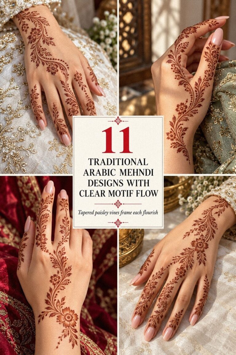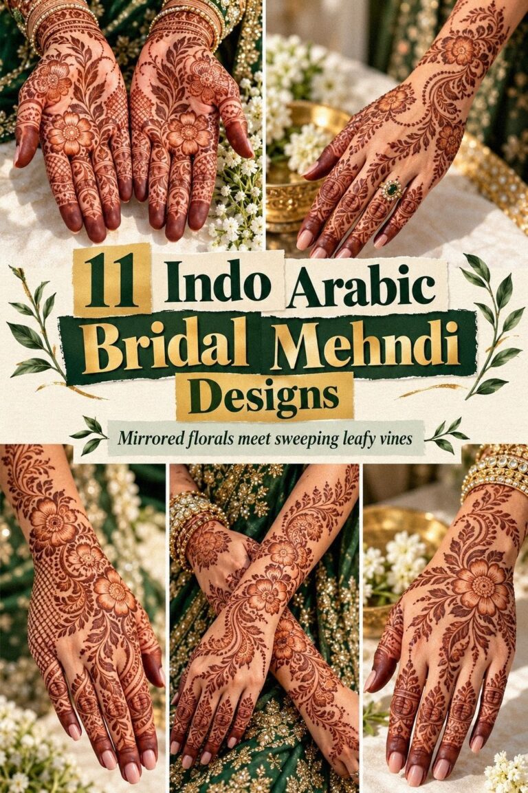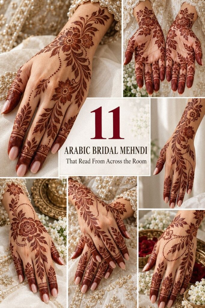
Arabic bridal mehndi designs can look intricate without covering every inch of skin. I wanted a striking pattern with flowing vines, crisp petals, and enough open space to keep my hands expressive. The cone dried in about 1 to 2 hours, then the reddish-brown stain deepened on day two. That change was the magic!
- I Chose Simple Arabic Bridal Mehndi Designs
- Which Arabic Bridal Mehndi Designs Survived the Shortlist?
- Farah’s Sketch Made the Layout Clear
Here’s What It Looked Like Before
Before the mehndi, my hands were completely bare except for two thin rings and a small bracelet I planned to remove. I had a wedding event ahead, but I didn’t want a dense design that swallowed my fingers or made every gesture look busy. The blank skin gave me room to decide slowly.
I kept looking at examples of simple new bridal mehndi designs and noticed the same problem: many patterns looked lovely in a reference but felt too crowded for my actual hands. I wanted an intricate Arabic trail, not a full block of paste. You’d think that choice would be easy.
It wasn’t.
The first thing I checked was the back of my hand, because that placement would remain visible during greetings, the ceremony, and family celebrations. I wanted the pattern to feel personal rather than copied from a reference.
My budget also shaped the decision. A smaller, open design offered better value than paying for dense coverage I didn’t really want. I wasn’t trying to make the design look inexpensive.
I was trying to make every curve count.
- I Chose Simple Arabic Bridal Mehndi Designs
- Which Arabic Bridal Mehndi Designs Survived the Shortlist?
- Farah’s Sketch Made the Layout Clear
- I Selected My Bridal Palm Motif
- Hands or Feet? Matching the Motifs
- I Added Bold Arabic Bridal Mehndi Details
- Two Hands, Two Rhythms
- What Made the Pattern Feel Bridal?
- A Flowing Forearm Extension That Stayed Readable
- Rings Versus Density
- I Finalized My Arabic Bridal Mehndi Design
1I Chose Simple Arabic Bridal Mehndi Designs
I began with a delicate vine on the back of my hand, then let it angle toward the index finger instead of stopping at the wrist. That slight diagonal made the pattern feel longer and more graceful. The cone tip gave me a narrow stream of brown henna paste, so I could draw leaves, dots, and small curved petals without pressing hard.
My first reference was simple Arabic mehndi designs, but I removed several filled flowers from the example. They looked ornate on the screen and heavy on my skin.
If you’re choosing a simple design, leave one clear strip of skin between the vine and your thumb. You’ll see the pattern better when you move your hand.
The best part was the contrast between the bare areas and the natural henna cone. The paste sat raised above the skin, almost like soft cord, while the untouched spaces kept the whole design crisp. I wanted something minimal, but minimal doesn’t mean plain.
I also kept the fingers lighter than the hand. Three tiny dots near the knuckles, one curved leaf, and a narrow fingertip band were enough. And if you’re saving references, compare easy Arabic mehndi designs beside your hand, not just on a bright phone screen.
The cone itself mattered more than I expected. A fresh cone produced a sleek line, while an older one dragged and created uneven edges. I asked about the paste freshness before paying, because that small detail affects the final result and the overall value of the appointment.
I chose the simpler layout because it felt more empowering than trying to imitate every elaborate bridal reference. The open skin made the central vine look sharper, and the whole design stayed graceful when I curled my fingers. That was the right call!
2Which Arabic Bridal Mehndi Designs Survived the Shortlist?
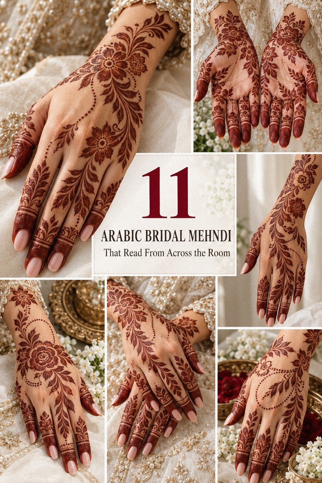
For both hands, I compared the latest Arabic bridal mehndi designs by looking for movement first. The strongest options used warm terracotta, clay, olive, and soft brown tones, so the eventual stain would feel rich without needing heavy coverage.
The Motifs I Kept and Cut
The paisley stayed because it felt timeless and symbolic without being overly literal. I gave it a pointed tip and a small inner curl, then left the surrounding skin untouched. That symbolic paisley carried more feeling than three unrelated flowers.
The leaves were intentionally uneven. One leaned forward, another turned back toward the wrist, and a third sat almost flat against the branch. Those small differences made the trail feel raw and handmade rather than mechanically repeated.
I kept one graceful flower near the wrist and cut two smaller flowers beside it. The remaining shape looked more meaningful because it had room to register. I wouldn’t pay extra for motifs that disappear into one another.
The price estimate also became clearer once I removed the filler details. The artist could focus on the central branch, clean fingertip work, and balanced spacing. I preferred paying for precise cone control instead of quantity.
3Farah’s Sketch Made the Layout Clear
I sketched the hand design on paper before touching the cone to skin. The drawing was rough, with one large paisley, three leaves, and a curved branch. That sketch exposed a problem immediately: the branch ended too close to the wrist, so the pattern looked chopped off instead of flowing.
I extended it with fine henna paste lines, then added a small open flower where the branch changed direction. The flower became the visual pause. It wasn’t large, but it gave the eye somewhere to rest before following the vine upward.
You should sketch at least one version with your fingers spread and another with your hand relaxed.
The wrist extension was where I became more opinionated. I skipped a thick cuff because it would have competed with my bracelet.
A slim chain of leaves looked more expressive, and it left enough bare skin for the design to breathe. Honestly, that choice made the whole piece feel more polished.
My artist kept the outer edges slightly irregular, which I preferred to a rigid printed look. Real paste has tiny differences in pressure, and those differences made the pattern feel personal. If you’re drawing your own Arabic bridal mehndi designs for hands, don’t chase mathematical symmetry.
The graceful curve matters more than identical leaves.
The paper sketch also helped me estimate time. The full layout took about 20 minutes to plan, but it saved much longer corrections later. That was a smart budget decision because I wasn’t paying for unnecessary adjustments once the cone touched skin.
I made one version with a fierce central branch and another with a softer curve. The softer version won because it followed my hand naturally. A design can be striking on paper and still feel wrong when the fingers bend.
For another reference point, I checked easy Arabic bridal mehndi designs and traced only the direction of the vines, not the exact motifs. That kept the result personal and stopped me from copying a finished hand.
4I Selected My Bridal Palm Motif
The palm motif became the emotional center, so I chose a sacred paisley instead of a generic flower. I kept the center open, added a small curl, and surrounded it with three leaves. The shape felt romantic and classic without becoming overly elaborate.
5Hands or Feet? Matching the Motifs
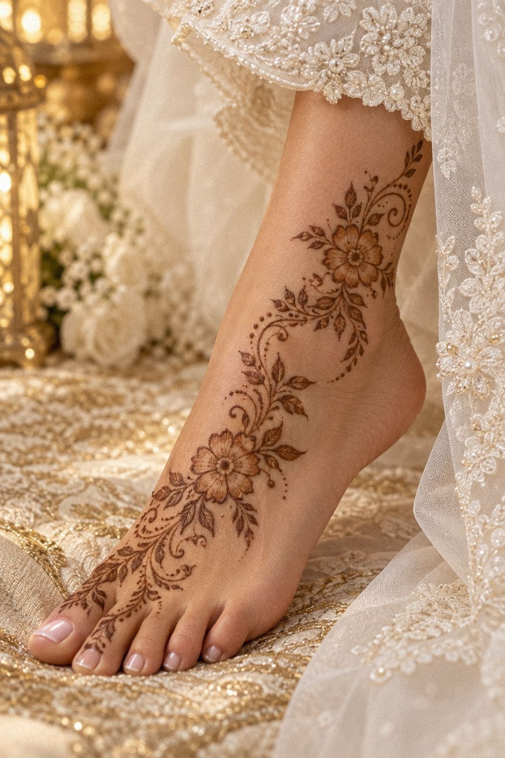
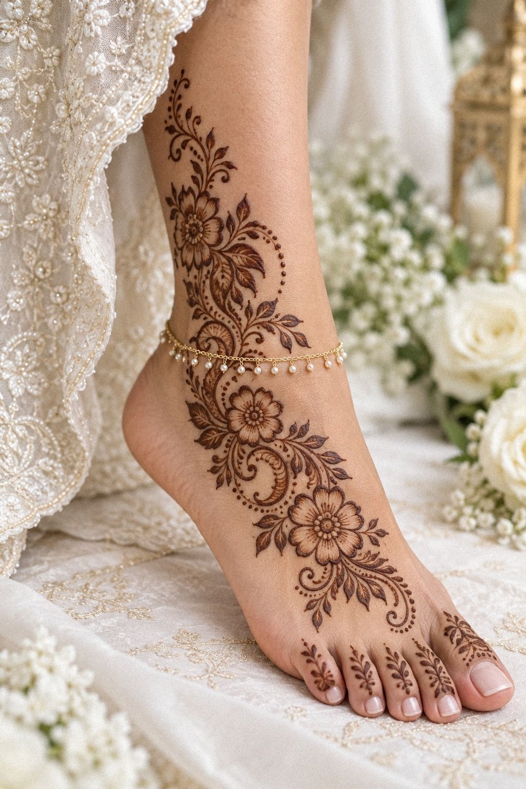
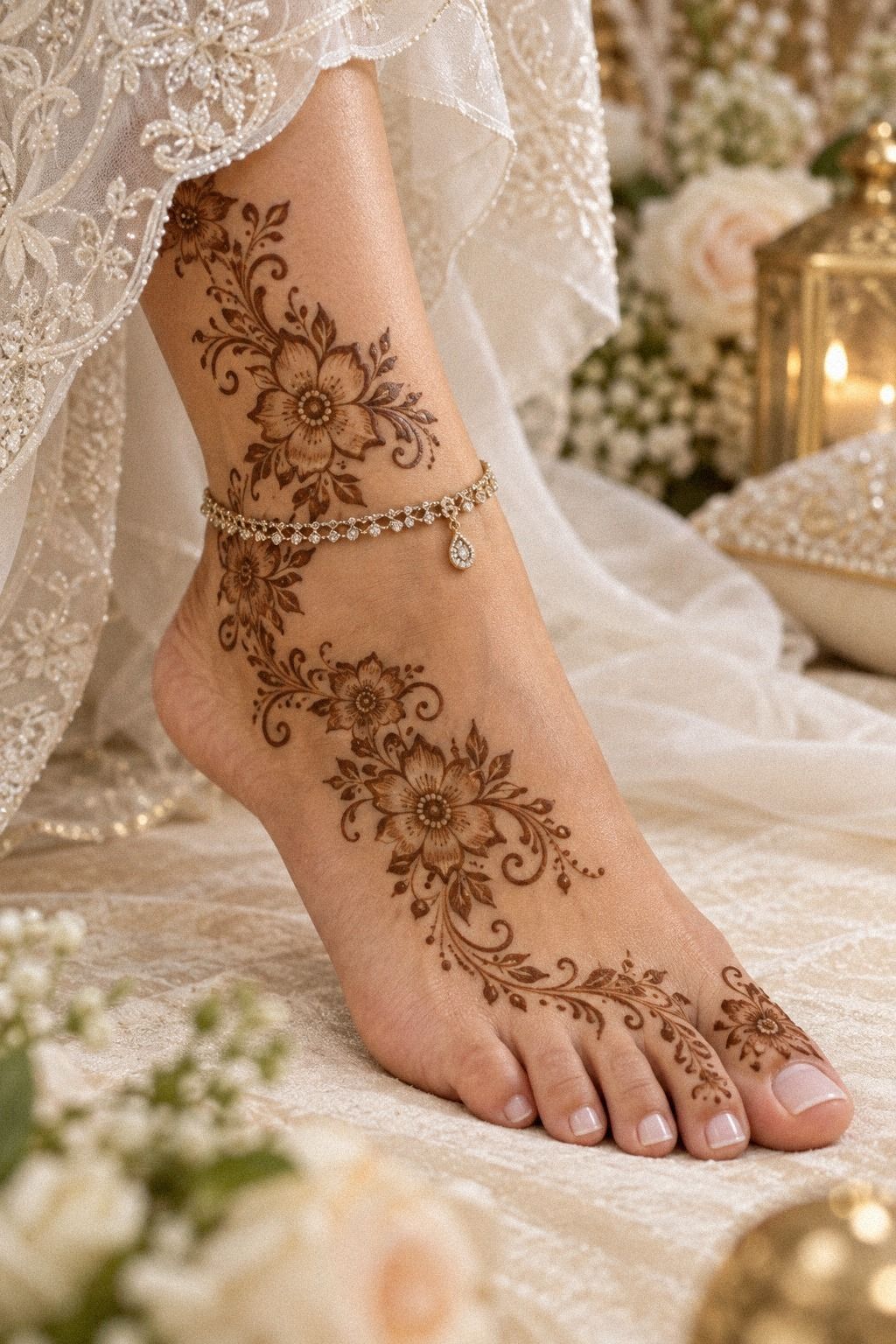
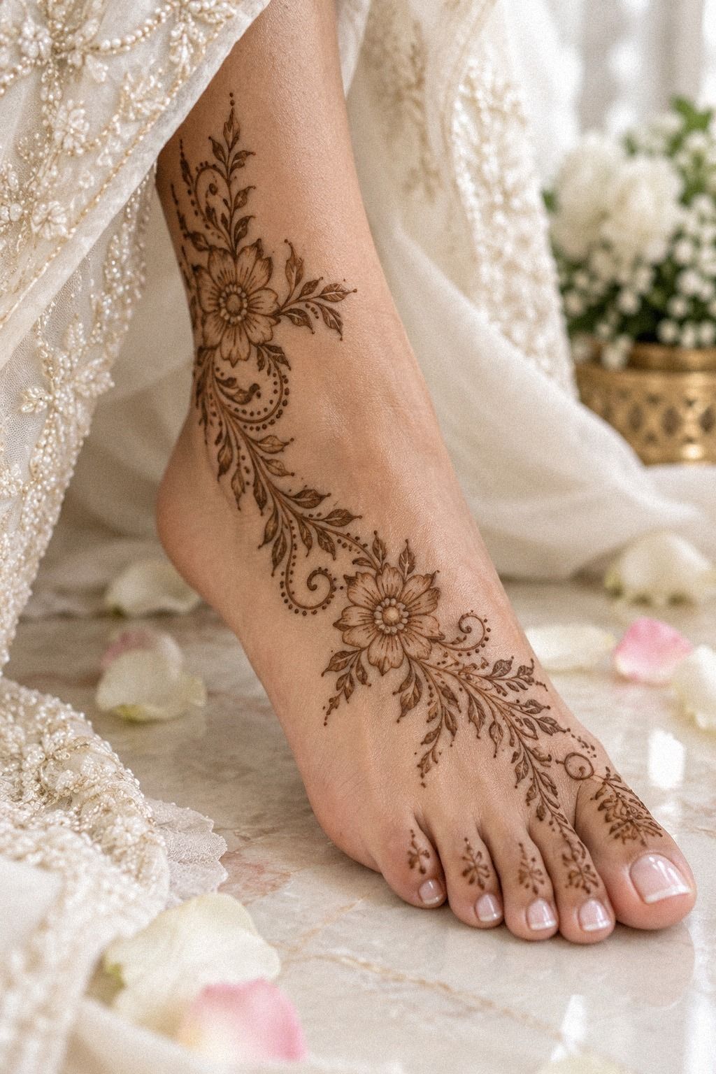
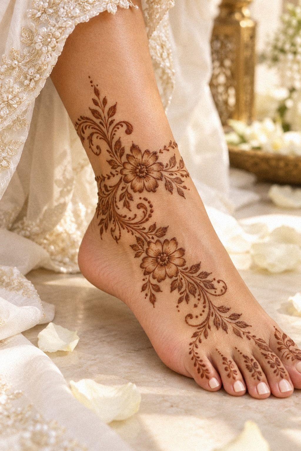
The design moved onto feet and ankles, where the same vine language needed a different scale. I matched small fingertip-style petals near the toes with a long vine running toward the ankle. The result was feminine but not fragile, and the open skin between motifs kept the pattern light.
I used eucalyptus-scented henna paste sparingly because the goal was a deep stain, not a thick coating. The toes received tiny arches and dots, while the ankle carried larger leaves. You can use the same motif family on hands and feet, but you shouldn’t duplicate every detail at the same size.
The ankle vine was the most daring part of the design. It curved around the side instead of forming a straight band, which made it look as though it was traveling naturally over the skin. I skipped a rigid border because it would have looked stiff beside the softer leaves.
Feet also need practical planning. You won’t want tight shoes while the paste dries, and you’ll need to keep the area dry during the initial setting period.
The final stain lasted roughly one to three weeks, depending on washing and sun exposure. I preferred this version to a solid foot panel because the flowing shape stayed expressive.
The added foot work increased the quote, but I thought it was worth the investment because it connected the whole bridal look. If your budget’s tighter, the same idea can be reduced to one ankle vine and a small toe accent.
I compared the lighter version with simple Arabic bridal mehndi designs for feet before approving it. The reference helped me judge scale, but I kept the final pattern narrower because I wanted my sandals and movement to remain practical.
How I Planned the Drying Window
I scheduled the application after my last major errand, not before it. That meant I could sit still, wear loose clothing, and avoid touching fresh henna paste while it set.
I kept lemon-sugar sealant nearby and asked the artist how much to use. Too little would let the paste flake early, while too much could make the surface sticky and uncomfortable.
The timing wasn’t glamorous, but it was practical. A beautiful design isn’t useful if you have to remove it before it has developed properly. I’ve learned that planning the drying window is part of the design itself.
I also kept my phone nearby before the application began, then switched it to silent. That small preparation kept me from bending my fingers or smudging the paste to answer messages.
6I Added Bold Arabic Bridal Mehndi Details
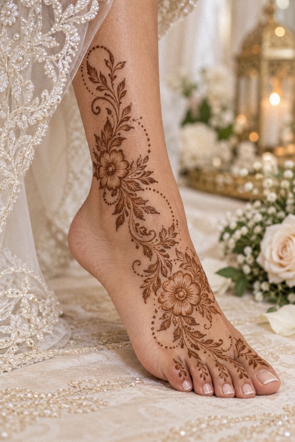
For the forearm and hand, I added bold details only where the design needed visual weight. A few vibrant terracotta accents in the reference sketches helped me imagine the eventual stain, but I kept the actual paste natural brown.
7Two Hands, Two Rhythms
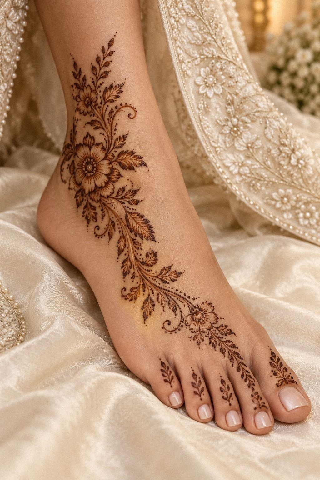
Both hands needed to speak to each other, but I didn’t want mirror-image designs. One hand received a large paisley and the other carried a lighter vine with a flower cluster. The relationship was balanced through shape and direction, not duplication.
I used sifted henna powder mixed into a smooth paste so the cone would glide without sudden lumps. That mattered around the fingers, where a wobble can interrupt an otherwise delicate line. You should test the paste on paper first, especially if your design depends on narrow curves.
The left hand became more understated because it carried my rings. The right hand received a little more detail near the thumb. That decision made the jewelry and mehndi work together instead of competing.
I skipped dense fingertip coverage because it hid the rings and made the hands look visually crowded.
A small mismatch between the hands can be charming. One leaf tilted farther outward, and I left it alone.
Perfectly matched patterns often look printed; slightly different branches look handmade. But the spacing still needed discipline, so I counted the open gaps between each major motif.
This asymmetry also affected the price. A custom pair can cost more than duplicating one pattern, but I thought the personal balance was worth it. The final result felt expressive rather than mass-produced.
For a third comparison, I saved latest Arabic bridal mehndi ideas and marked the layouts with different hand positions. That showed me which patterns worked beyond a single reference.
8What Made the Pattern Feel Bridal?
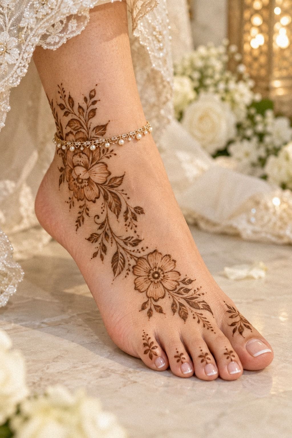
The bridal feeling came from proportion, not maximum coverage. A few elegant motifs, thoughtful gaps, and one iconic central shape gave the design more presence than a crowded palm.
9A Flowing Forearm Extension That Stayed Readable
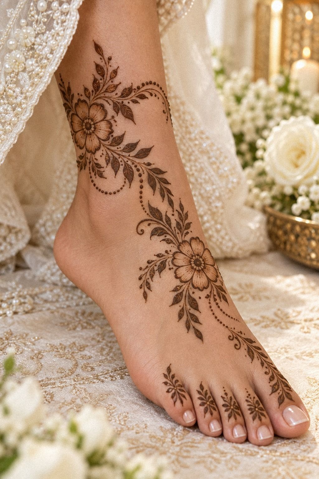
The forearm extension began with a single curved stem that rose from the wrist and widened near the elbow. I tested it with my arm relaxed, bent, and turned sideways. The flowing shape stayed readable in all three positions, which was more useful than a design that only worked in one pose.
I added hand-rolled henna cones for the final application because the tip gave me control over the long vine. The stem remained sleek, while the leaves became larger as they moved upward. That scale change made the extension feel organic without filling the entire forearm.
I almost added a second branch on the inner arm, but I stopped. The extra detail looked impressive in the sketch and busy on skin.
This was the moment I learned that restraint can be more dramatic than another flower. You should check the layout from several distances before approving extra motifs.
The finished extension felt ethereal when the wet paste was removed and only the stain remained. It connected the hand to the arm without creating a heavy border. If you like a longer design, easy Arabic mehndi designs with vines can help you compare vine lengths and placement ideas.
The artist charged more for the extension because it added application time. I accepted that cost because the added length changed the whole silhouette. If you’re working within a strict budget, stopping at the wrist can still create a complete result.
I asked for a final comparison beside simple new Arabic mehndi designs to judge the proportion. The finished version looked more daring than my first sketch, but it still felt personal and controlled.
10Rings Versus Density
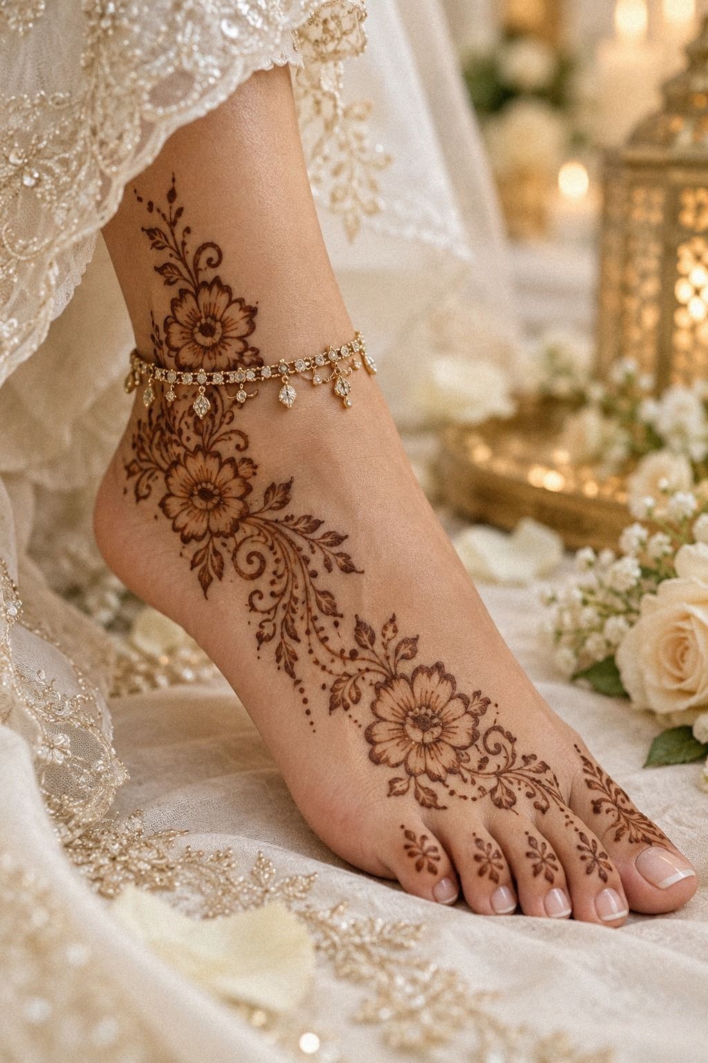
My rings changed the design more than I expected. I kept the finger joints mostly clear so the metal wouldn’t disappear against a dense brown stain. The palm received the richer motif, while the fingers carried narrow arcs and isolated dots.
I used fine-tip mehndi cones around the jewelry lines because they allowed smaller gaps. Those gaps gave the rings room to catch light and kept the fingers comfortable during the drying period. If you’re wearing rings for the event, test the design with them on before the paste is applied.
The central finger received a dainty trail, while the ring finger stayed simpler. That asymmetry made the arrangement feel playful rather than overly controlled. I skipped heavy fingertip blocks because they would have pulled attention away from the palm motif.
This was also a practical choice. A lighter finger design is easier to protect while the paste sets, especially if you need to answer a message or adjust your clothing. The final stain looked crisp around the rings, and the whole hand felt polished without losing its handmade character.
I removed the rings during application, then checked their position after the paste had dried. That small step prevented smudging and helped me judge whether the spacing was right. It also made the appointment feel more organized.
The lighter finger plan lowered the amount of paste slightly, but I didn’t choose it only to save money. I chose it because the ring placement deserved to remain visible. That made the final result sharper.
The Details That Changed the Result
The most important detail was the open skin around each motif. It made the design look sharper and allowed the reddish-brown stain to develop without merging into one heavy shape.
I also asked for slightly irregular leaves. A perfectly repeated leaf can look mechanical, while small differences make the pattern feel raw and personal.
The artist’s pressure changed near the fingers, where the skin moved more. That variation wasn’t a flaw. It gave the design a handcrafted quality and made each hand feel individual.
I wouldn’t spend extra money chasing perfect symmetry. I’d spend it on fresh paste, careful placement, and enough time for the application. Those choices had a bigger effect on the final result.
One practical detail mattered most around the feet: I wore open sandals after the appointment. The loose footwear protected the drying paste and kept the ankle motif from rubbing away too soon.
11I Finalized My Arabic Bridal Mehndi Design
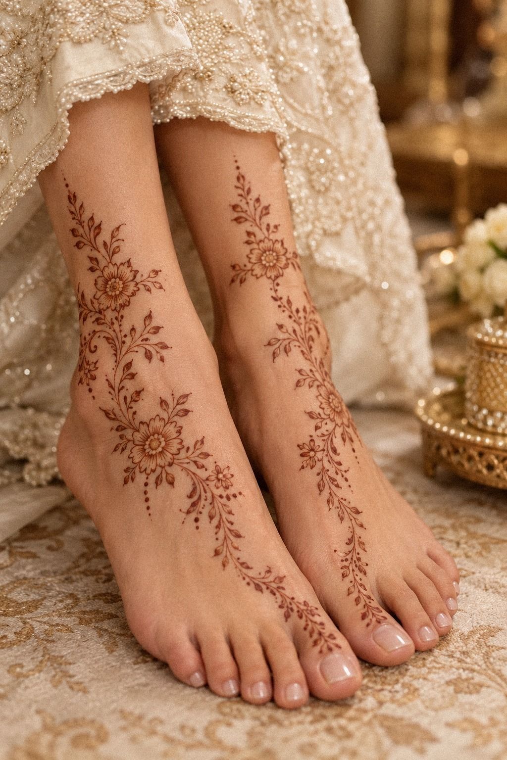
The last design returned to the feet and ankles, where I finalized the same visual language with a richer central paisley. The final version felt vintage in its motif choices but stylish in its open spacing.
How Much It Cost
I kept the money question honest because henna pricing depends on whether you work with an artist, buy a cone, or prepare the paste yourself. For my design, I used one cone, a small amount of lemon-sugar sealant, and a little eucalyptus oil already available at home, so my extra material cost was $0. I wouldn’t pretend that equals a professional appointment.
The bigger investment was time. The application took about 2 hours because I chose hands, forearms, feet, and ankles rather than one small motif.
The paste then needed roughly 1 to 2 hours to dry, and the stain deepened on day two. That’s the schedule you should plan around.
These are planning ranges, not fixed prices. An artist in a major city may charge more, while a smaller custom layout may cost less. Ask for a quote based on the exact placement, density, and number of people before the occasion.
For my full design, the professional price would have been far higher than the material cost, but I still think it could be worth it for a wedding. The value comes from clean application, design planning, and not having to manage the cone yourself.
If you’re working with a smaller budget, choose either the hands or the feet, then keep the same paisley and vine language. A focused design can look more polished than an oversized one with rushed details.
I also asked about professional Arabic bridal mehndi designs before booking. Seeing several price levels helped me separate genuine application skill from unnecessary density.
What I Learned From Choosing Henna Over More Coverage
I used to think bridal mehndi had to look elaborate to feel special. After comparing dense palms, open vines, fingertip bands, and ankle trails, I changed my mind. The most memorable version was the one with a clear route for the eye: paisley, leaf, flower, pause.
The paste also taught me to respect timing. A fresh stain isn’t the final color, and a pale first result doesn’t mean you chose badly. Mine moved from orange to a deeper reddish brown by day two.
That gradual shift felt almost ceremonial, especially because the design was already tied to a real occasion.
My mistake was planning too many small motifs at the beginning. I thought more detail would make the piece more expressive, but it only reduced the open space. When I removed half the dots, the main vine became more visible.
You can save yourself that indecision by choosing one hero motif before the cone touches skin.
I also learned that practical details matter as much as symbolism. Drying time, clothing, rings, shoes, washing, and sunlight all affect the experience.
A bold design isn’t useful if you can’t sit comfortably while it sets. The most elegant choice is the one you’ll enjoy wearing through the whole event.
The final stain made me rethink the budget, too. I didn’t need the most expensive package to get an empowering result. I needed an artist who understood spacing, fresh paste, and the way the design should move across my skin.
If I did it again, I’d keep the same open paisley layout and simplify the feet slightly. The hands carried the emotional center, while the ankle work served as a graceful echo.
I would also save easy Arabic bridal mehndi patterns before meeting the artist, then circle only the motifs that genuinely fit my hand. That made the consultation quicker and kept my choices focused.
A Few Things Worth Answering
How long does Arabic bridal mehndi last?
In my experience, Arabic bridal mehndi lasts about one to three weeks, depending on skin, washing, sunlight, and placement. The stain starts lighter, then deepens around the second day. My palms developed the richest color, while the forearm faded sooner because it was washed more often.
How long should henna paste stay on the skin?
I left the paste on for roughly 1 to 2 hours before gently removing the flakes. Lemon-sugar sealant helped keep it attached while it dried. I avoided rubbing the design against clothing, jewelry, or shoes because early friction can remove paste before the stain develops.
Is Arabic bridal mehndi suitable for a first application?
I think it is, especially with open vines and moderate density rather than a completely filled design. The style gives you a clear focal motif, graceful movement, and enough bare skin to keep the result readable. A simple layout is also easier to protect while it dries.
How do I choose a mehndi artist?
I would look for an artist whose portfolio shows clean cone control, consistent curves, and clear examples of finished stains rather than only wet paste. I’d ask whether the paste is fresh, whether aftercare is explained, and whether the design can be adjusted around rings or clothing.
How should I care for fresh bridal mehndi?
I kept the paste on until it dried fully, removed it gently, and limited water exposure soon afterward. I used mild washing, avoided swimming and strong sun, and didn’t scrub the stain. I also asked about lemon-sugar sealant and eucalyptus oil before the application.
What is the best placement for Arabic bridal mehndi?
For me, the backs of the hands, palms, wrists, feet, and ankles all worked well. Palms and soles often stain deepest, while wrists and forearms give vines more length and movement. I’d choose placement based on visibility, clothing, rings, and how much drying time I could protect.
Is professional mehndi worth the cost?
For a wedding, I think it can be worth the cost if the artist offers fresh paste, thoughtful placement, and a design consultation. I wouldn’t pay extra simply for maximum coverage. I’d pay for clean lines, reliable timing, and a pattern that feels personal.
Where I’d Start First
If I had to pick one, I’d start with the open paisley and wrist vine. It gives you the strongest shape without burying your hands in paste, and the clear skin makes the day-two stain look deeper. Save that reference from simple new bridal mehndi designs, protect the drying time, and let the design stay personal.
If you prefer a lighter version, compare it with easy Arabic mehndi designs and remove any detail that doesn’t serve the main curve. Trust me! The most memorable result isn’t always the largest one.